Speech Therapy Center of Exellence Rebranding
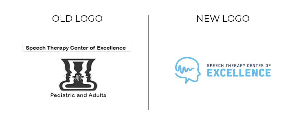
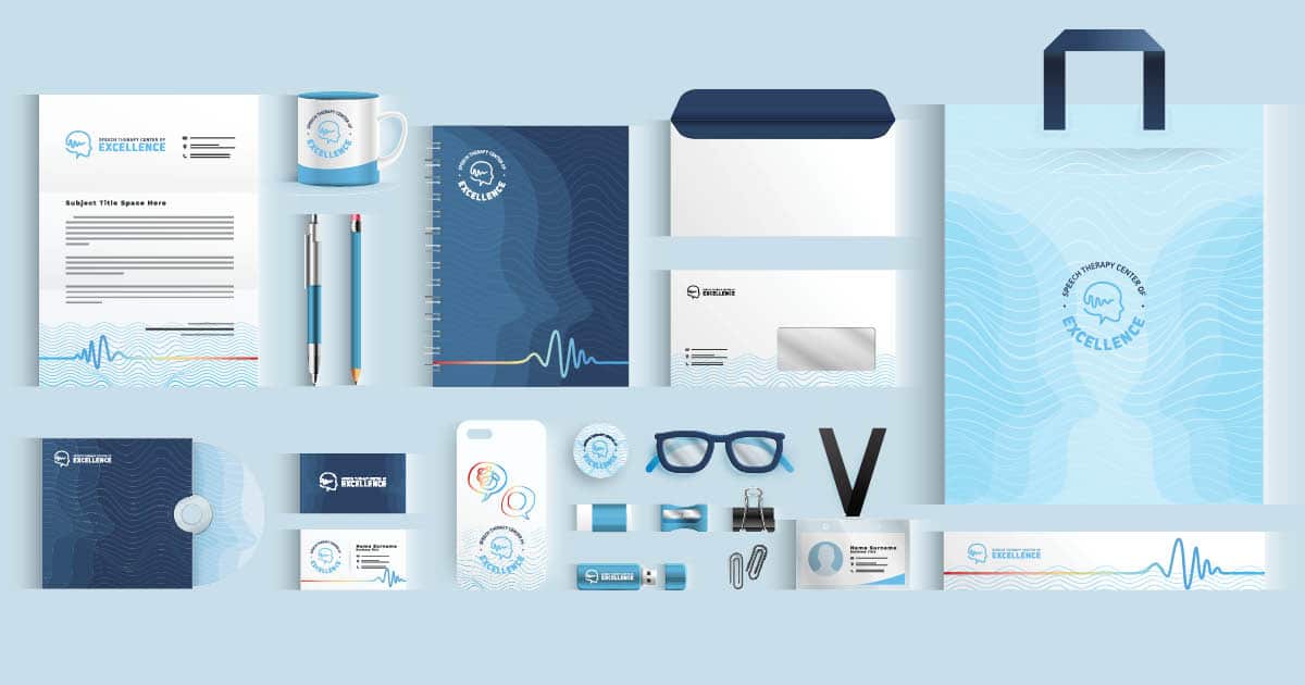
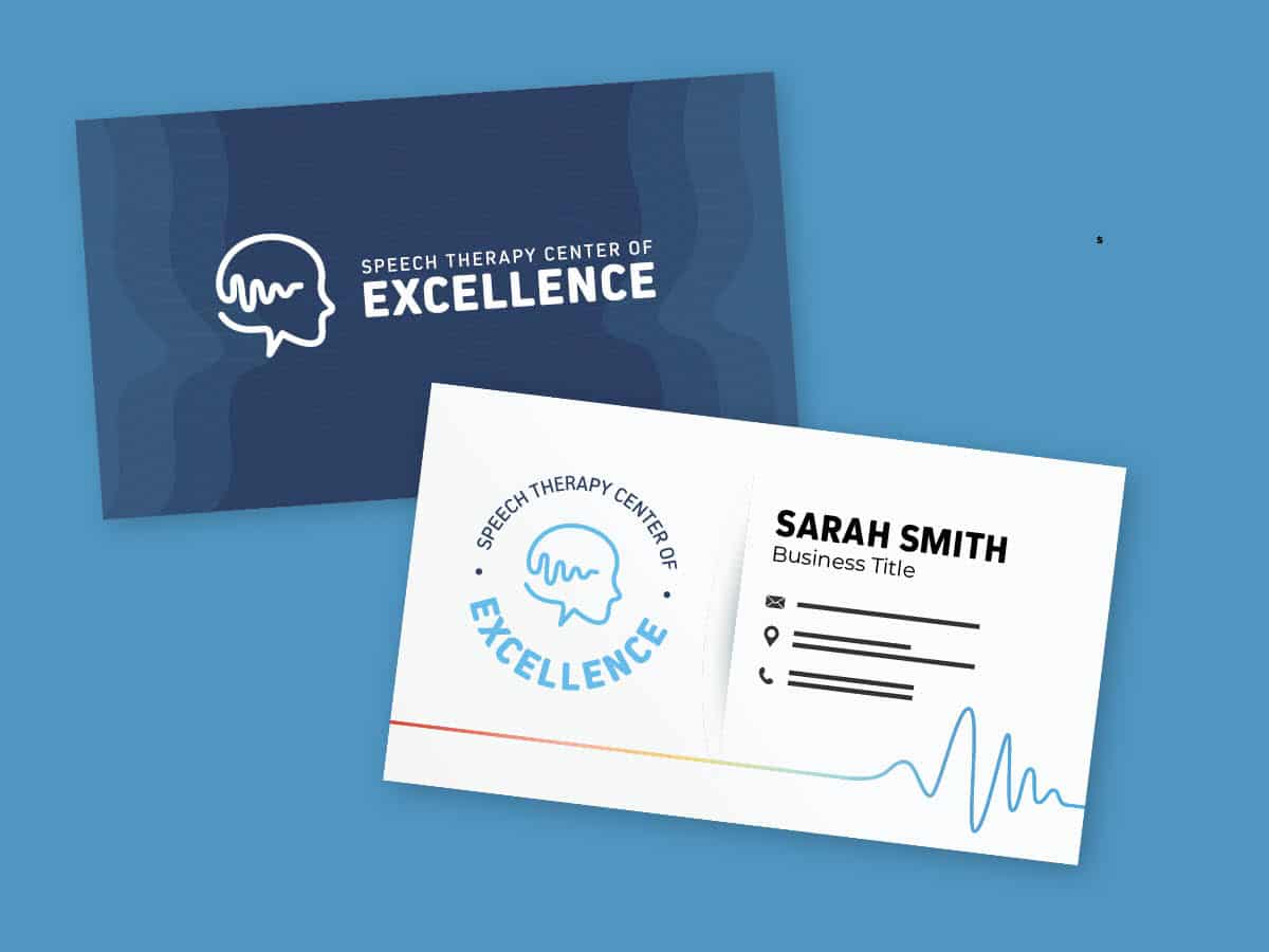
A Speech Therapy center approached me with an outdated 13-year-old logo and website, seeking a complete rebranding. They had specific requirements: a modern, minimalist design that incorporated both a sound wave and a simplified human element into the logo. After exploring numerous logo concepts, we ultimately settled on the following design.
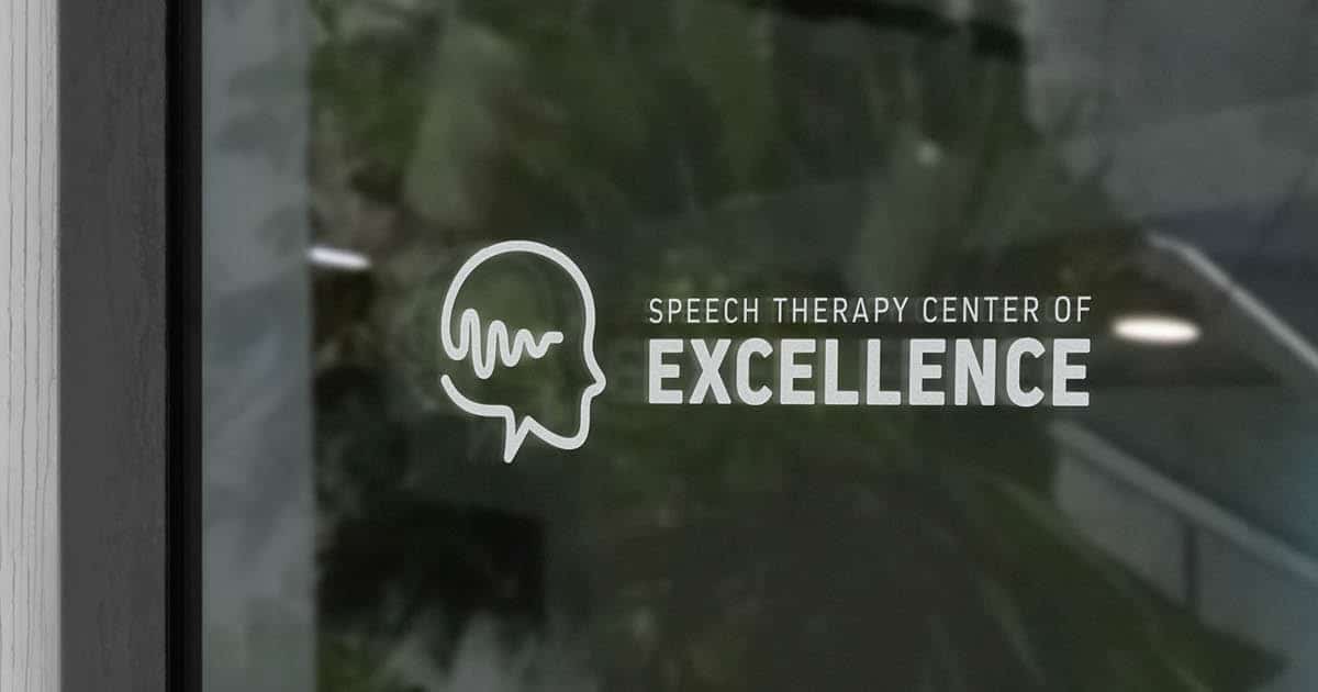
The logo encompasses an abstract representation of human head outlines, cleverly forming an intricate soundwave pattern in the background. This symbolic imagery conveys the cognitive dimension of speech, emphasizing the vital role of thinking and processing in effective communication. To enhance the overall aesthetics and mood, we opted for a soothing and gentle blue color palette that evokes feelings of tranquility and harmony.
In our redesign, we strategically positioned the word “Excellence” at the forefront of the design, giving it a bold and prominent presence. This deliberate choice elevates the establishment’s name, emphasizing it as more than just a simple “speech therapy center.”
In addition to the logo rebranding, we completely overhauled their website to align with the new brand identity. Our primary focus was on enhancing the user experience to ensure a seamless and engaging interaction for visitors.
Client
Speech Therapy Center of Excellence
PROJECT
Rebrand and Website Rebuild
Duration
1 Month
Category
Branding

